

Promote purchasing by creating an eye-catching POP! Points to note when writing
In-store POP used in supermarkets, drug stores, etc. In order to attract the attention and interest of people visiting your store and encourage their purchasing behavior, it is important to create a conspicuous POP that naturally draws their eyes.
In order to attract attention to new products and best-selling products, or to convert slow-selling products into purchases, we ask questions such as "How should I write a POP?" and "What should I do to avoid a POP that just stands out?" Some people may be looking into this.
In this article, we will explain how to create a POP that stands out, as well as points and precautions.
This article explains how to make an ad that stands out. Please also check.
Attract attention with eye-catching advertisements! Key points for creating advertisements to increase appeal
Table of contents [hidden]
- 1.Role of in-store POP
- 2.How to write a POP that stands out and key points
- 2.1.① Examine the target and the information you want to convey
- 2.2.② Decide on the design
- 2.3.③Write in a clear layout
- 3.Points to note when writing outstanding POP
- 4.Achieving “standout POP” through analysis based on emotional neuroscience
- 5.Summary_
Role of in-store POP
In-store POP has the role of attracting the attention of visitors, increasing awareness, and highlighting the appeal of the product.
By designing POP content that takes into account the behavior and psychology of customers, such as near entrances, product shelves, aisles, and next to cash registers, you can encourage the actions you want them to take.
It is also useful to convey information that benefits visitors, such as sales and limited-time products, and to introduce reviews and recommended points to create a system that makes them want to buy.
How to write outstanding POP and key points
In order to create a POP that stands out and attract the attention of visitors, it is important to be creative with the information it contains, its layout, and design.
Here, we will explain how to write POP that stands out and the key points.
① Examine the target and the information you want to convey
The method of conveying information differs depending on the gender and age of the target person.
The key is to identify the information you want to include in your POP, keeping in mind the product's target audience, and thinking about what you want to convey to whom and what action you want them to take after reading it.
▼Points for identifying information to be included in POP
- Express product characteristics (location of use, purpose of use, frequency, price range) in easy-to-understand language
- Think about the product's target audience
- Think of a message that appeals to the issues and needs of your target audience.
- Describe the benefits of purchasing and using the product
② Decide on the design
Once you have decided on the information to be included, decide on the rough design of the POP. At that time, you will need to decide on the font, placement, illustrations, photos, etc. to be used.
Incorporating catchphrases and specific numbers will not only make it easier to understand the content at a glance, but will also increase the appeal.
▼Points of design in POP
point |
Concrete example |
Use fonts that match the product image |
|
Use colors that express the message you want to convey based on the psychological effects of colors |
|
Use illustrations and photos that are reminiscent of the product or usage scene |
|
Include specific numbers to increase persuasiveness |
|
③Write in a clear layout
When writing POP, one of the key points is to create a clear layout by adjusting the arrangement of information and font size.
By adding visual contrast, you can make the message you want to emphasize stand out and attract the attention of visitors. It is also possible to improve visibility to make the contents of POP easier to read and to make it look cleaner.
▼Layout points
- Arrange vertical writing, horizontal writing, etc.
- Limit font sizes and font types to 2-3
- Don't pack in too much information, leave some blank space
- Enlarge/color catchphrases and important parts
Points to note when writing eye-catching POP
When writing a POP that stands out, you need to be careful about the information you include and the color scheme so that visitors can understand the content at a glance. The main points to note are as follows.
Prioritize information
It is important to prioritize information in advance so that visitors can instantly understand what you most want to convey.
If too much information is included in POP, it becomes difficult to understand the content at a glance. If you have a lot of information to convey, using bullet points to concisely summarize it is effective.
Be conscious of consumer-oriented design
In order to create a POP that will attract the attention of visitors, it is important to consider the design from the consumer's perspective. For example, products for women tend to prefer dull or pastel colors, while products for men tend to prefer cool colors or achromatic colors.
▼Example of design from consumer perspective
Product type |
Examples of designs that are easy to like |
Character goods |
Bright and pop design |
Health conscious natural foods |
A design that incorporates green that evokes nature and blue that evokes health. |
groceries |
Design that increases appetite by incorporating red and orange colors |
Products for young people |
Trendy design that incorporates buzzwords and trendy characters |
Don't use too many colors
If you use too many colors in your in-store POP design, it will be difficult to instantly determine which information is important. The key is to limit the number of colors used to about three in order to make the information easier to read and give a sense of unity to the overall design.
Achieving “standout POP” through analysis based on emotional neuroscience
When creating a POP, in order to determine whether the design will truly catch the attention of customers, it is necessary to test it by actually placing it in the store. However, the person who created the POP inevitably feels that it stands out, so it is difficult to judge it objectively.
Analysis tools based on emotional neuroscience are useful for objectively and quantitatively verifying whether a product is a noticeable POP.
Konica Minolta's `` Explainable KANSEI'' is based on cognitive theory in brain science, and it is possible to scientifically analyze the act of ``seeing.'' We visualize the purchasing process, from awareness to interest, comparison, and purchase, and scientifically unravel the designs that sell.
▼ Approach from the human purchasing process based on Explainable KANSEI
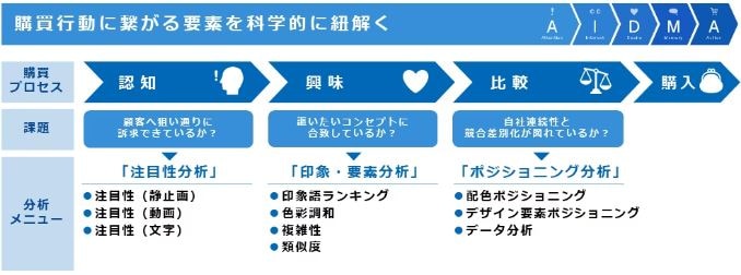
By visualizing the movements of consumers' gaze, such as ``which part attracts attention'' and ``which part is likely to be looked at for a long time,'' consider the design and layout of POP that easily attracts the eye and supports purchasing behavior. can.
For more information, please click here.
summary
In this article, we explained the following about how to write a POP that stands out.
- Role of in-store POP
- How to write outstanding POP and key points
- Points to note when writing eye-catching POP
- Analysis tools based on emotional neuroscience that help create POPs
In-store POP has the role of attracting the attention of visitors, increasing awareness, and promoting products. In order to support purchasing behavior with more eye-catching POP, it is important to carefully examine the target audience and the information you want to convey, and then devise a design and layout that allows you to understand the appeal and appeal points at a glance.
Konica Minolta's Explainable KANSEI allows you to visualize and quantitatively analyze people's eye movements and impressions. By designing based on emotional brain engineering, you can create an outstanding POP that leads to purchase.
For more information about our services, please see this document.