JP

Website design production example
Objectively and quantitatively judge design proposals that are close to the appealing image and attract attention!
konica minolta
Own business site (Explainable KANSEI)
Results obtained
Objectively and quantitatively determine the design proposal that is closer to the appealing image of the concept "science" and attracts more attention than the A/B web design candidates. The design decision process went smoothly.
Improvement flow
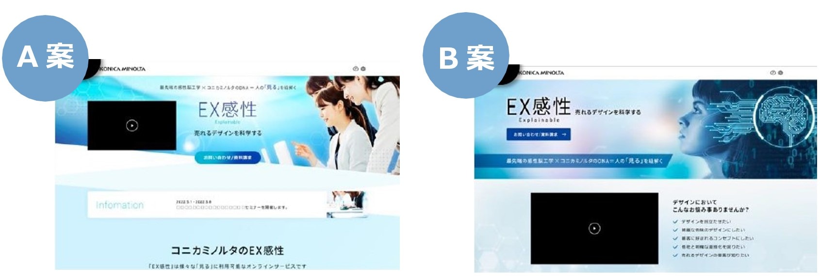
1. web design ideas
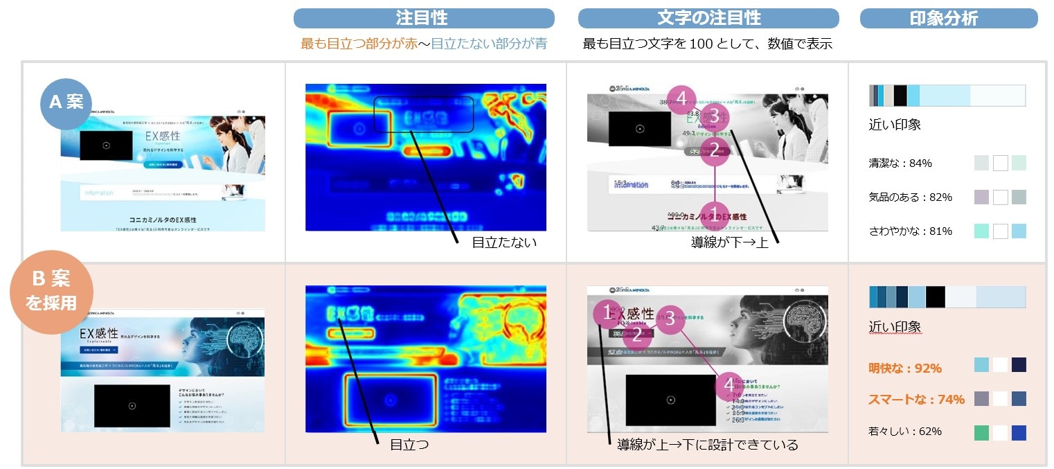
We evaluated the two proposals A and B, which were created as drafts, in three ways: "attentionality," "attentionality of characters," and "impression analysis." The decision was made to investigate whether the flow line arrangement was appropriate and whether it was close to the "science" image.
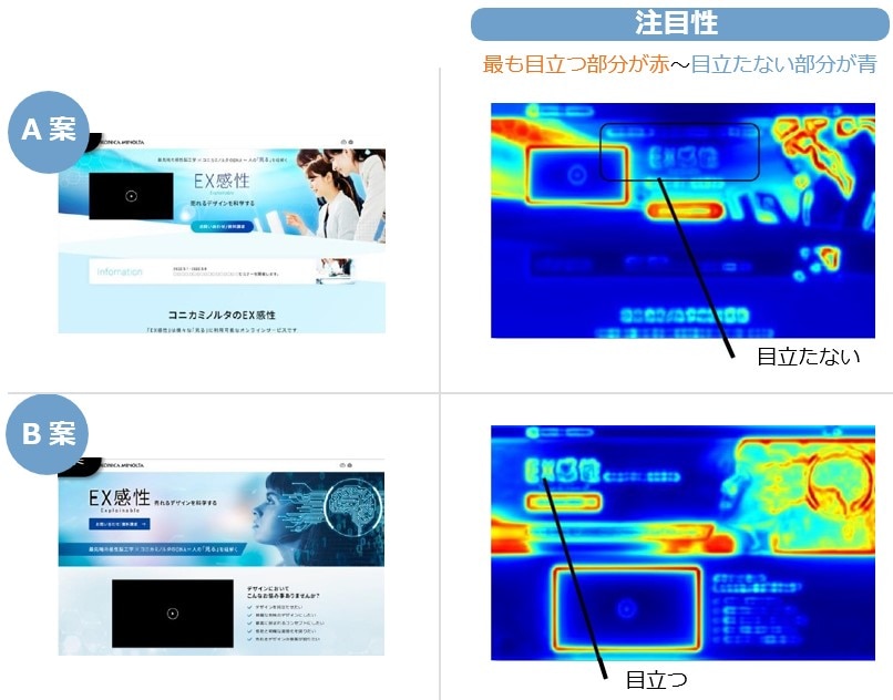
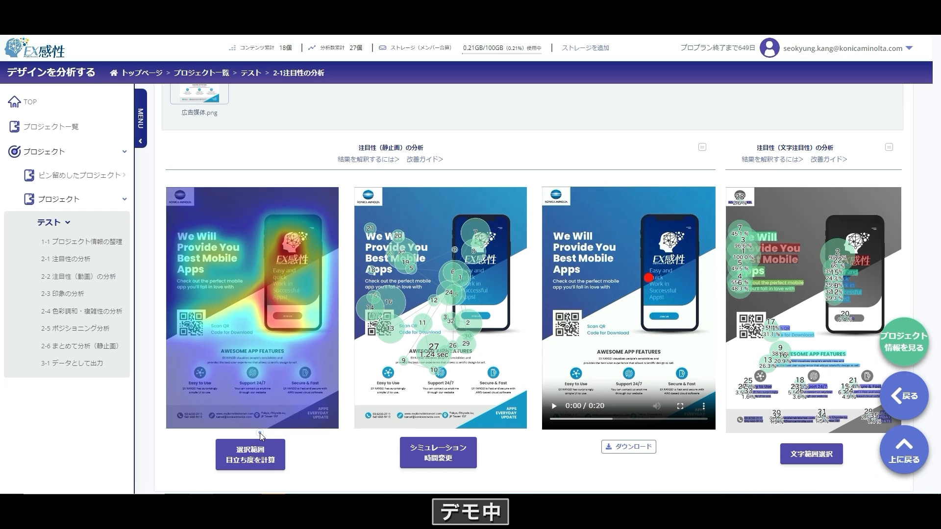
2. Attention analysis
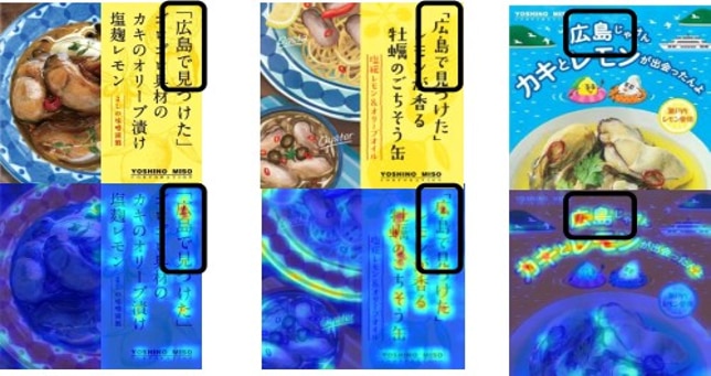
First, we conducted an analysis of "attentionality" to see if the points we wanted to appeal to were clearly noticeable.
Since the most conspicuous parts are displayed in red and the less conspicuous parts in blue, we can see that there is a big difference in the conspicuousness of the service name "Explainable KANSEI" between plans A and B. Ta.
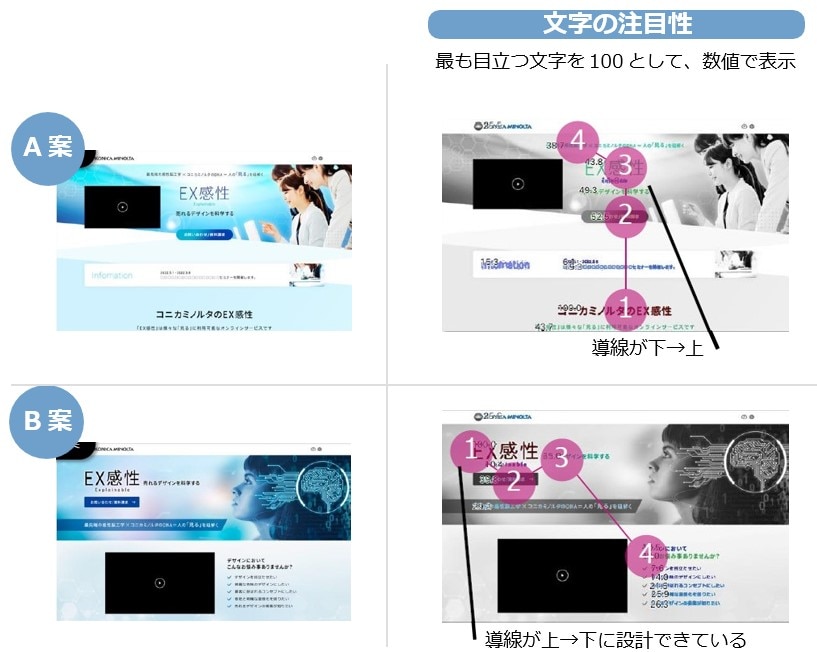
3. Analysis of character attention
Next, we analyzed the ``attentionality of characters'' to determine if the line of sight was appropriate.
The most prominent character is 100, and it is displayed numerically, so in option A, the eye first goes to the heading at the bottom and then goes up, whereas in option B, the eye goes to the service name first, then goes down. It was confirmed that the line of sight was flowing in the same direction.
The most prominent character is 100, and it is displayed numerically, so in option A, the eye first goes to the heading at the bottom and then goes up, whereas in option B, the eye goes to the service name first, then goes down. It was confirmed that the line of sight was flowing in the same direction.
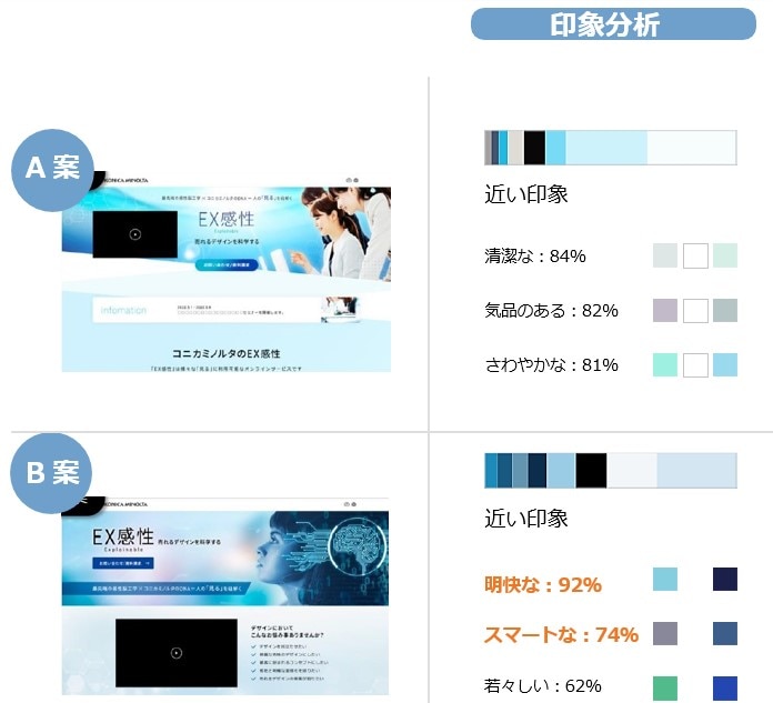
4. Impression analysis
Finally, we conducted an "impression analysis" to see if it was close to the appeal image. The concept for this website design was "science." We evaluated it based on whether it was close to this image.
Plan A was analyzed to be closer to the image of "clean," "elegant," and "refreshing," while plan B was analyzed to be closer to the image of "clear," "smart," and "youthful." Turns out.
We concluded that Plan B is closer to the "science" image.
5. Design selection
From the results of "attentionality", "attentionality of text", and "impression analysis", we can objectively verify that plan B is closer to the appealing image and is a design that is more likely to attract attention. The proposal was selected as the final proposal.
A design proposal that closely matches the appeal image and attracts attention
Able to judge objectively and quantitatively!
Able to judge objectively and quantitatively!
\Now offering a 14-day Free Trial campaign/
Explainable KANSEI has been featured in many major media outlets such as Nihon Keizai Shimbun and NHK.
Would you like to try it for free too?
Would you like to try it for free too?
Other success stories
We have achieved great results by improving the design of various materials such as advertisements, menus, web packages, etc.
Please check the results for yourself.
menu design
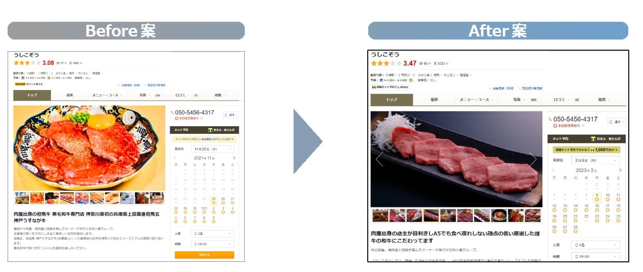
In addition to the color that gives a sense of luxury, we have improved the way to draw attention to the meat, increasing the reservation rate from the web to 172%!
Direct mail (DM)
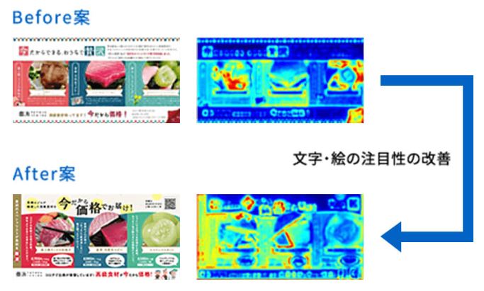
The improved design was ranked number one in a local media newspaper, greatly contributing to increased recognition!
package design
The improved package design received a high score of 4.6 out of 5 when evaluated by experts!
Explainable KANSEI I want to know more about
With service materials, webinars, and demo videos. If you see this, you'll definitely want to use your Explainable KANSEI.
Understand in 3 minutes!
Explainable KANSEI Overview Material

Find out in the video!
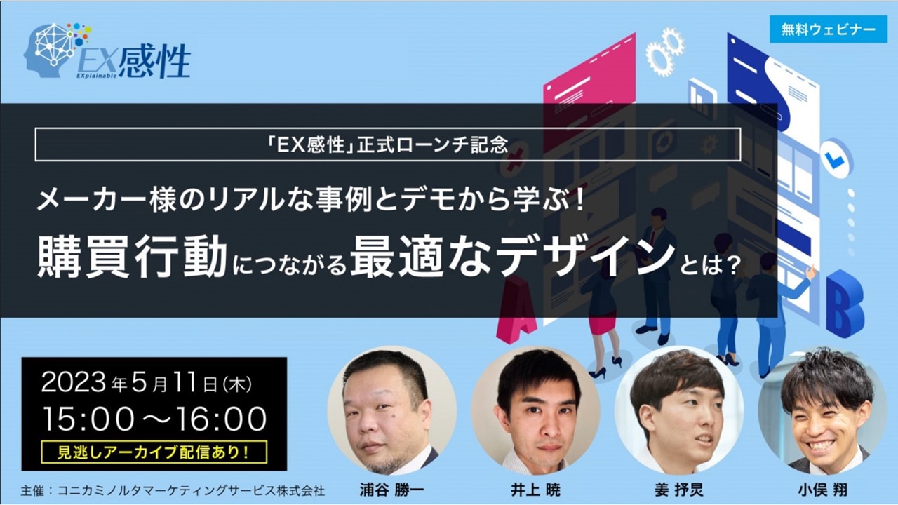
Latest popular webinar
Understand through actual operation!
Explainable KANSEI demo video
\Now offering a 14-day Free Trial campaign/
Explainable KANSEI has been featured in many major media outlets such as Nihon Keizai Shimbun and NHK.
Would you like to try it for free too?
Would you like to try it for free too?