
Tips for choosing Promotion Materials designs! Things to be careful of to avoid mistakes
Promotion Materials are tools aimed at increasing product awareness and encouraging purchasing behavior. Typical examples include POP, posters, flyers, DM (direct mail), catalogs, etc.
Promotion Materials are used in a variety of situations, such as product advertising, campaign information, and in-store appeal, but "design" is an important point in effectively approaching customers.
Some store managers and marketing department staff may have challenges such as, "I want to use Promotion Materials to increase sales," or "I want to choose a design that conveys the quality of my product and catches my eye."
In this article, we will explain the role of Promotion Materials design, tips for selecting effective designs, and points to keep in mind to avoid mistakes.
This article explains the role of POP and the key points on how to make it. Please also check.
Table of contents [hidden]
- 1.The design of Promotion Materials influences purchasing intent.
- 2.Tips to keep in mind when selecting the design of Promotion Materials
- 2.1.① Use a color scheme that matches the image of the product
- 2.2.② Arrange the layout so that it is easy to read
- 2.3.③ Make the content clear at a glance
- 2.4.④ Include information that encourages action
- 3.Points to note to avoid mistakes in selecting the design of Promotion Materials
- 4.Summary_
The design of Promotion Materials influences purchase intent.
Promotion Materials have the role of increasing awareness of products, stimulating interest, and encouraging purchasing behavior.
Among them, design elements such as color scheme, fonts, and images are related to the impression of the viewer. These elements have the power to express the appeal of a product and appeal to people's sensibilities. Design changes the image of the product and the ease with which information is conveyed, which is thought to influence customers' purchase intentions.
A design that naturally catches the eye not only helps you gain recognition, but also makes it easier to remember. By making a strong impression on the contents of Promotion Materials, there are cases in which customers will remember the product name or brand name, or they will visit your store or website.
In addition, a design that clearly conveys the product's features and appeal will arouse customer interest and stimulate their desire to buy and use the product. This can also be expected to encourage purchasing behavior and lead to increased sales.
Tips to keep in mind when choosing the design of Promotion Materials
When ordering the production of a design for Promotion Materials, there are cases where you are worried about which one to choose from among the multiple design proposals. In order to create a design that attracts customers' attention and increases their desire to purchase, it is important to keep the following tips in mind.
①Choose a color scheme that matches the image of the product
The trick to designing Promotion Materials is to choose a color scheme that matches the image of the product.
Colors have psychological effects that affect people's impressions and emotions, and the image changes depending on the type of color, Lightness, Chroma, and color scheme pattern.
By choosing a color scheme that expresses the concept and world view of your product, you can bring out the impression you want to give to customers and appeal to their emotions and sensibilities.
▼Images of representative colors
Color types |
Imagery that evokes |
red |
love, passion, strong |
blue |
quiet, rational, academic |
green |
Safe, fresh, young |
yellow |
Attention, joy, vitality |
orange |
Delicious, gorgeous, cheerful |
purple |
Mysterious, noble, intelligent |
tea |
Umami, calm, bitterness |
pink |
Cute, gentle, happy |
gray |
Elegant, humble, urbane |
White |
Pure, clean, transparent |
black |
cool, clear, heavy |
Also, limiting the number of colors used in the design to about three will give a more cohesive impression. The impression will also change depending on the color ratio and the combination of similar and complementary colors.
▼Points to consider when choosing a color scheme
- Set the ratio of base color, main color, and accent color to 70:25:5
- If you want to create a unified atmosphere, use similar colors.
- If you want to create an impact, choose a base color that is complementary to the main color.
- Match Lightness and Chroma of each color
② Arrange the layout for easy viewing
When designing POP, posters, flyers, pamphlets, etc., the trick is to arrange the layout so that it is easy to read.
If the text and images are misaligned or if the information is scattered, it may be difficult for customers to read and they may not receive the information you want to convey.
To make Promotion Materials easy to read, it is important to organize and arrange information as well as align objects to create a clear layout.
▼Layout points
- Align vertical and horizontal lines when placing text and images
- Limit the number of fonts and sizes to around two or three.
- Change the font size for titles, body text, and captions
- Group and arrange the information you want to include
When considering the layout, it is effective to place objects while keeping in mind the flow of the eye in the shape of the letter “Z.”
This article introduces how to create a layout that takes eye movement into consideration.
③Make sure that the content is conveyed at a glance.
It is also important that customers can understand the content of POP, posters, flyers, etc. at a glance.
By creating a design that allows you to understand at a glance what the product is and what it is trying to say, it becomes easier to understand the information intuitively.
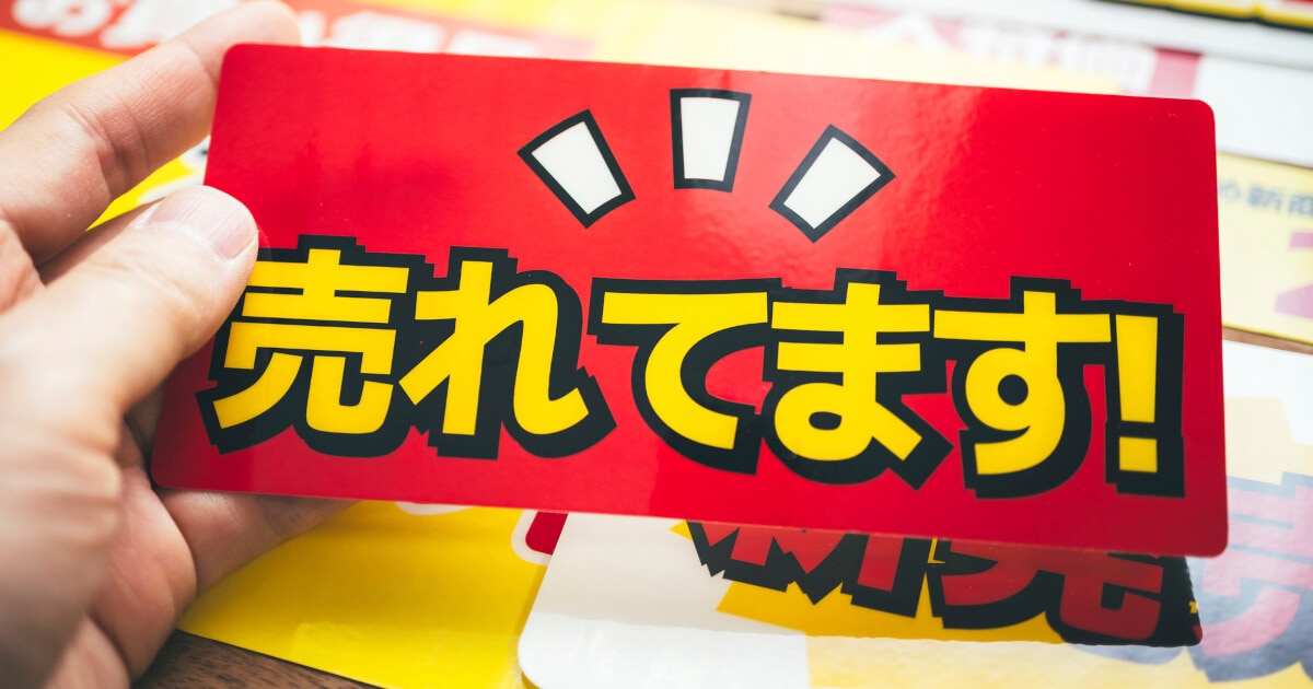
The trick is to keep the message simple and appeal visually with key visuals such as images and illustrations.
▼How to convey content at a glance
- Insert a catchphrase that encourages customer empathy and caution
- Depending on the information you want to convey in Promotion Materials, include product images, illustrations, or image photos in the key visuals at the top or center.
- Emphasize titles and headings by making them larger or by using different colors.
④ Include information that encourages action
To encourage customer purchasing behavior, it is important to include information in Promotion Materials that encourages the next action.
When customers see POP, posters, flyers, etc. and think, "I'd like to visit your store" or "I might check out your website," they are more likely to take action.
▼Examples of information to encourage action
- Store basic information (address, map, business days, business hours, contact information)
- Website URL or QR code
- SNS account name or QR code
- Coupon code that can be used in stores and websites
- Benefits limited to those who bring Promotion Materials to the store
By including information such as discounts and campaigns that can be used at your store or website, you can create a sense of specialness and attract more customers.
Important points to remember when selecting the design for Promotion Materials
When choosing the design of Promotion Materials, please keep the following points in mind:
▼Notes
- Clarify the target group you want to appeal to
- Choose designs and information according to the target group and the situation in which it will be used.
It is important to think about ``what you want to convey to whom'' when choosing a design for Promotion Materials. By clarifying your target audience, you can provide information based on their issues and needs, create messages that resonate with them, and consider color schemes that resonate with their sensibilities.
Additionally, a design that focuses only on visual impact or stylish design may not reflect the product's impression or may make it difficult to convey the appeal.
In order to increase the appeal of Promotion Materials, it is necessary to choose the design and information to be included depending on the target group you want to see and the situation in which you will use them.
summary
In this article, we explained the following about the design of Promotion Materials:
- Role and importance of Promotion Materials
- Tips to keep in mind when choosing the design of Promotion Materials
- Important points to avoid failure
The design of Promotion Materials affects the impression they leave on customers and how easily information is conveyed. To increase purchasing desire and encourage product purchases, the design must be easy to understand and attractive for customers.
It is also important to consider the situation in which Promotion Materials will be used and select the design and information based on whether it will "easily attract attention" and "appeal to the sensibilities" of the target audience.
However, the evaluation of Promotion Materials tends to depend on the intuition and experience of the person creating them, and it can be difficult to quantitatively and objectively evaluate their level of attention or impression.
Konica Minolta's "EX Kansei" is based on cutting-edge image analysis technology and Kansei brain engineering, and can quantitatively analyze and evaluate eye movements and impressions in the sales floor. By visualizing customer sensibilities, it is possible to optimize designs by eliminating subjective judgments by personnel.
For detailed service details, please check this document.